Product Redesign
Rebuilding Visualping’s Chrome extension
Making it easier to monitor any page, without asking people to learn the system behind it.
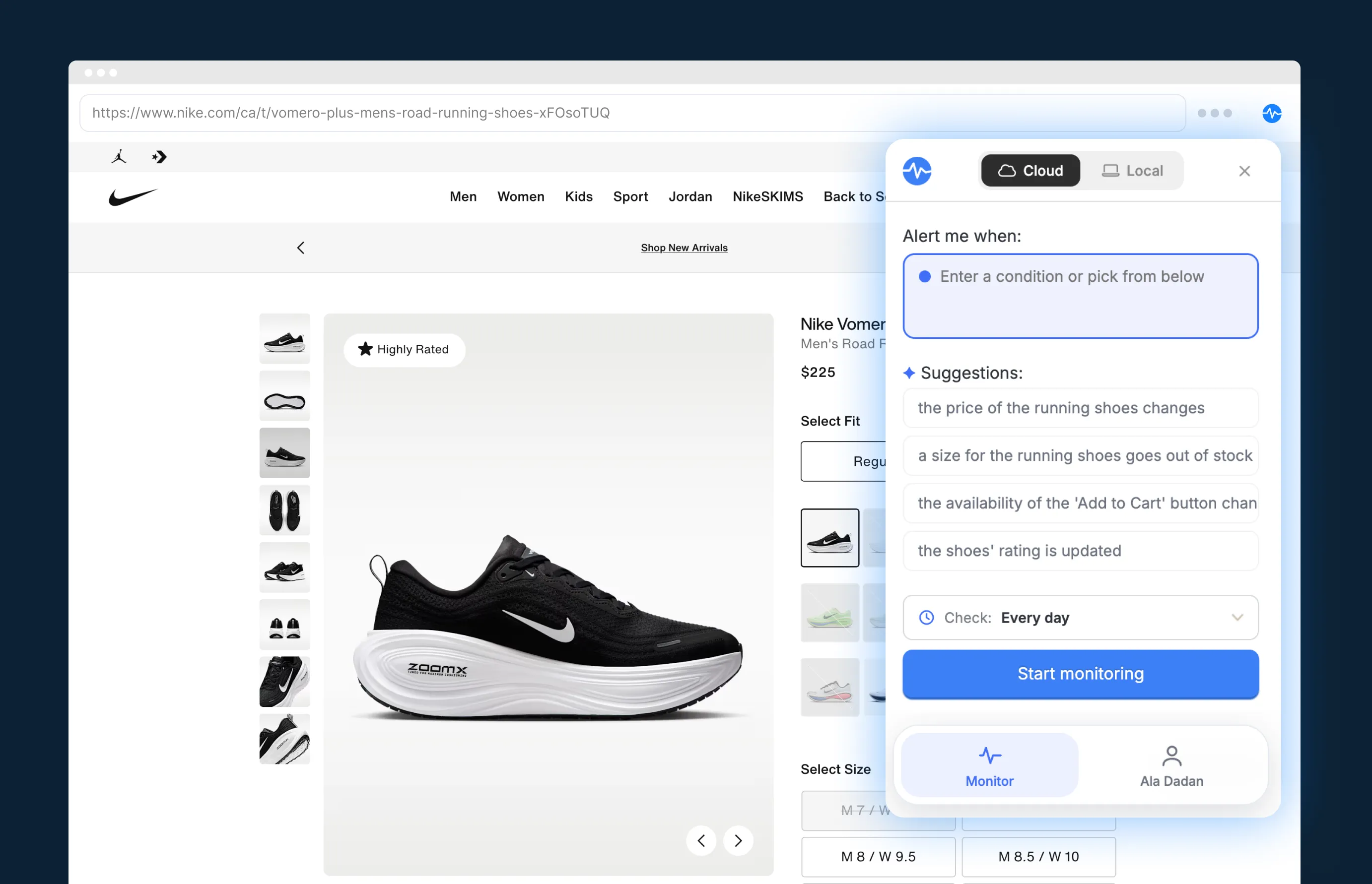
Visualping monitors web pages and alerts people when something changes, from a price drop to a policy update. Its Chrome extension is the fastest way to start: open it on a page, choose what to watch, and let Visualping handle the checking. I led the redesign from the first audit through launch.
The extension had grown complicated
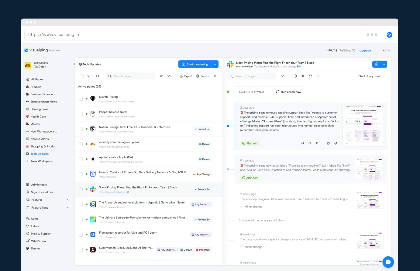
The old extension worked, but product logic had found its way into the interface. People navigated two levels and faced labels like jobs, dynamic pages, and default compare before they could start monitoring.
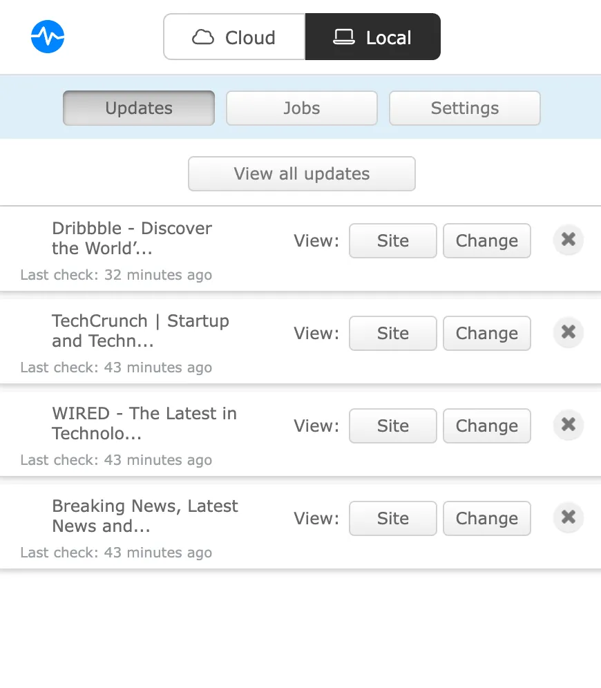
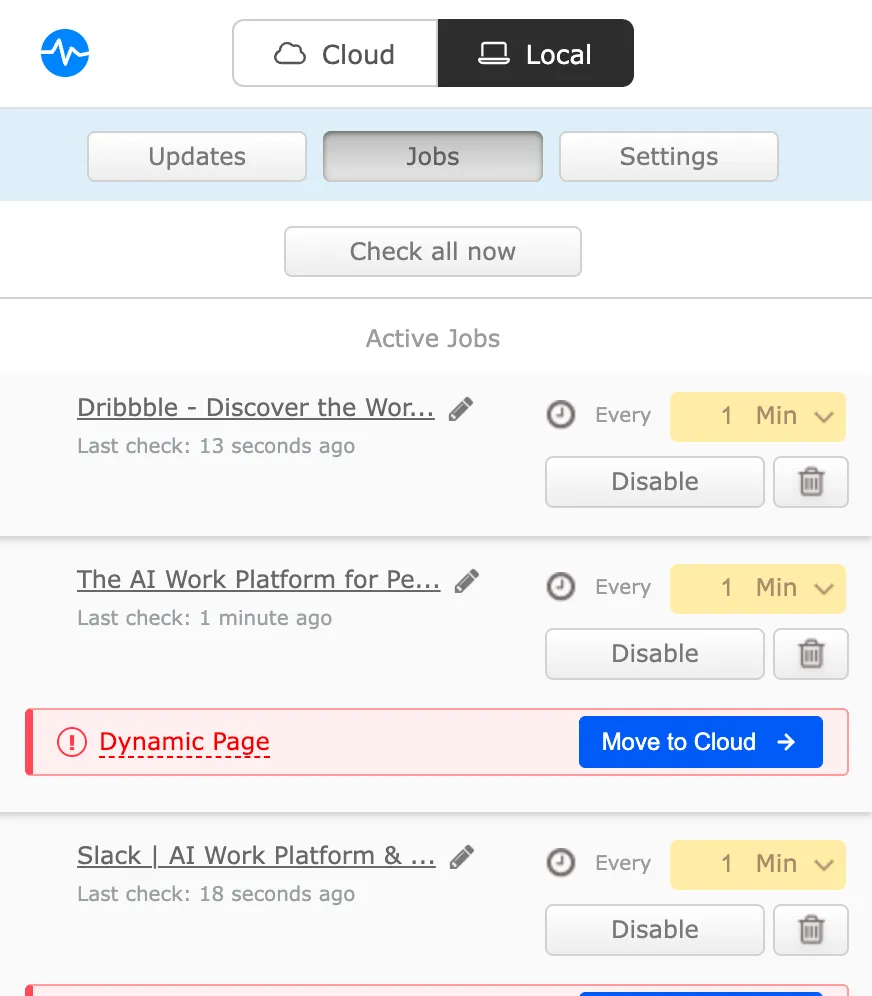
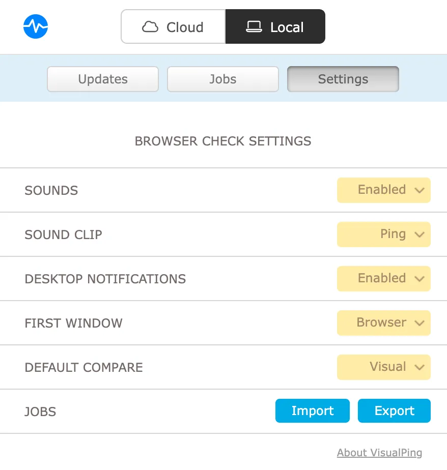
Two ways to monitor, one product
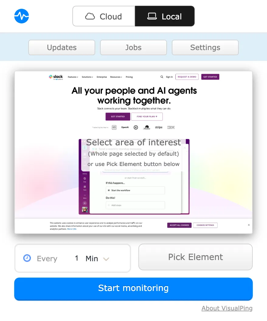
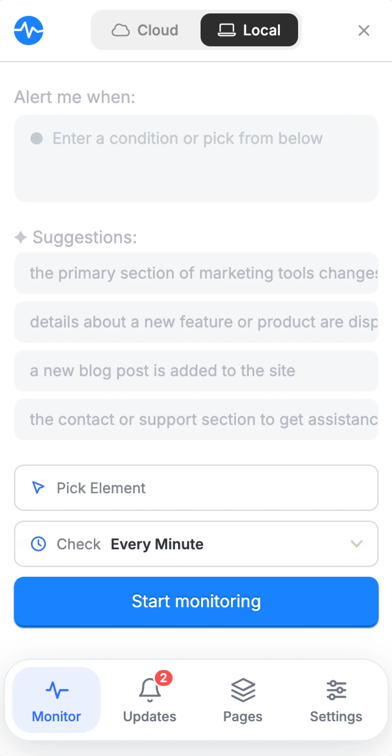
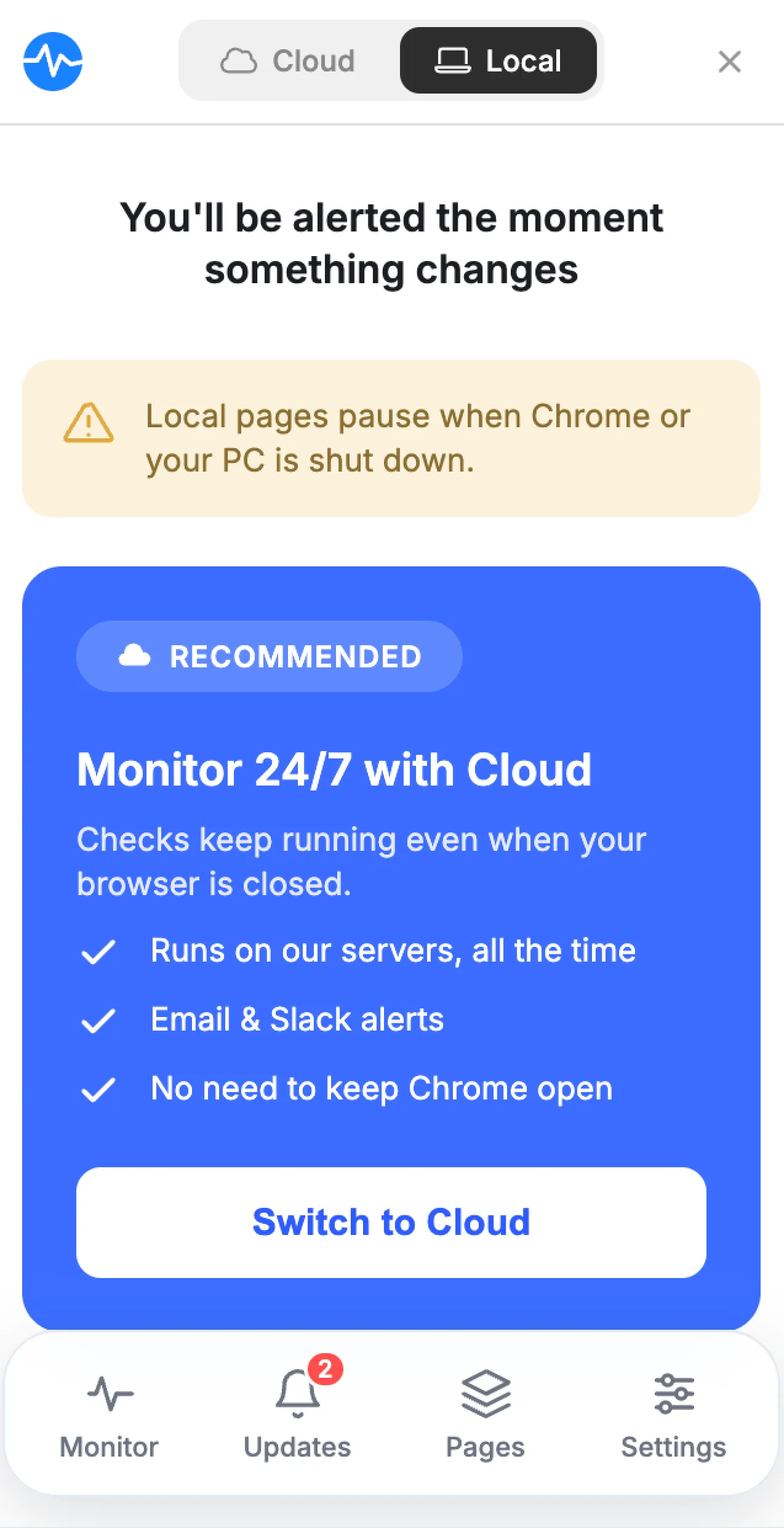
The extension offers two ways to monitor a page. Local checks run in Chrome without an account, but stop when the browser closes. Cloud checks run on Visualping’s servers and continue when the computer is off. Both solve a real need, but the old experience exposed the technology behind them. I needed to make the difference clear without making people decode the architecture.
Cloud
Keeps monitoring when you’re away
Runs continuously, 24/7
- Works independently of your browser
- Continues when your computer is off
- Supports more capable cloud AI models
- Sends alerts by email, text, Slack, and Teams
Local
Runs on your machine
Needs the browser open to monitor
- Uses computer resources to monitor the page
- Notifications limited to in-browser alerts
- Uses limited browser AI models, currently in development
Start with what matters
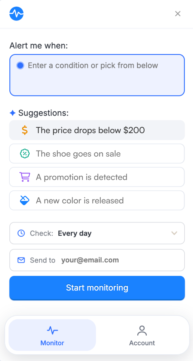
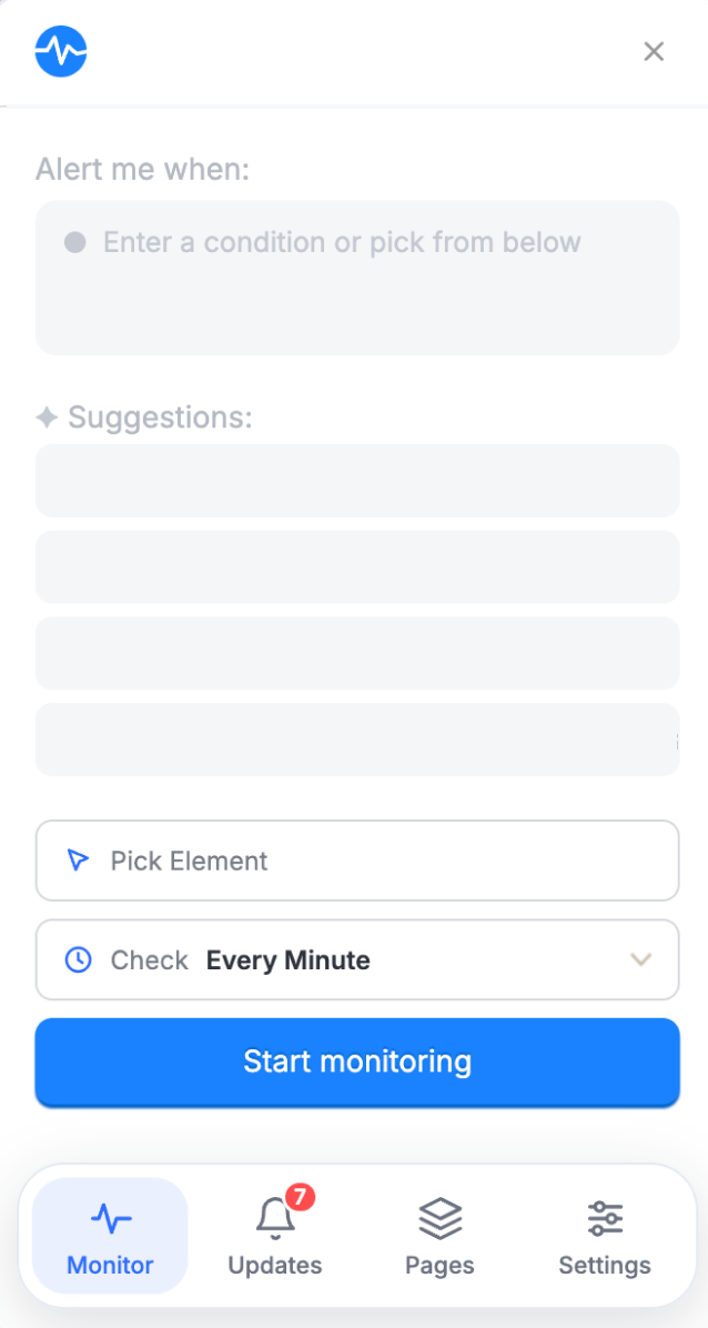
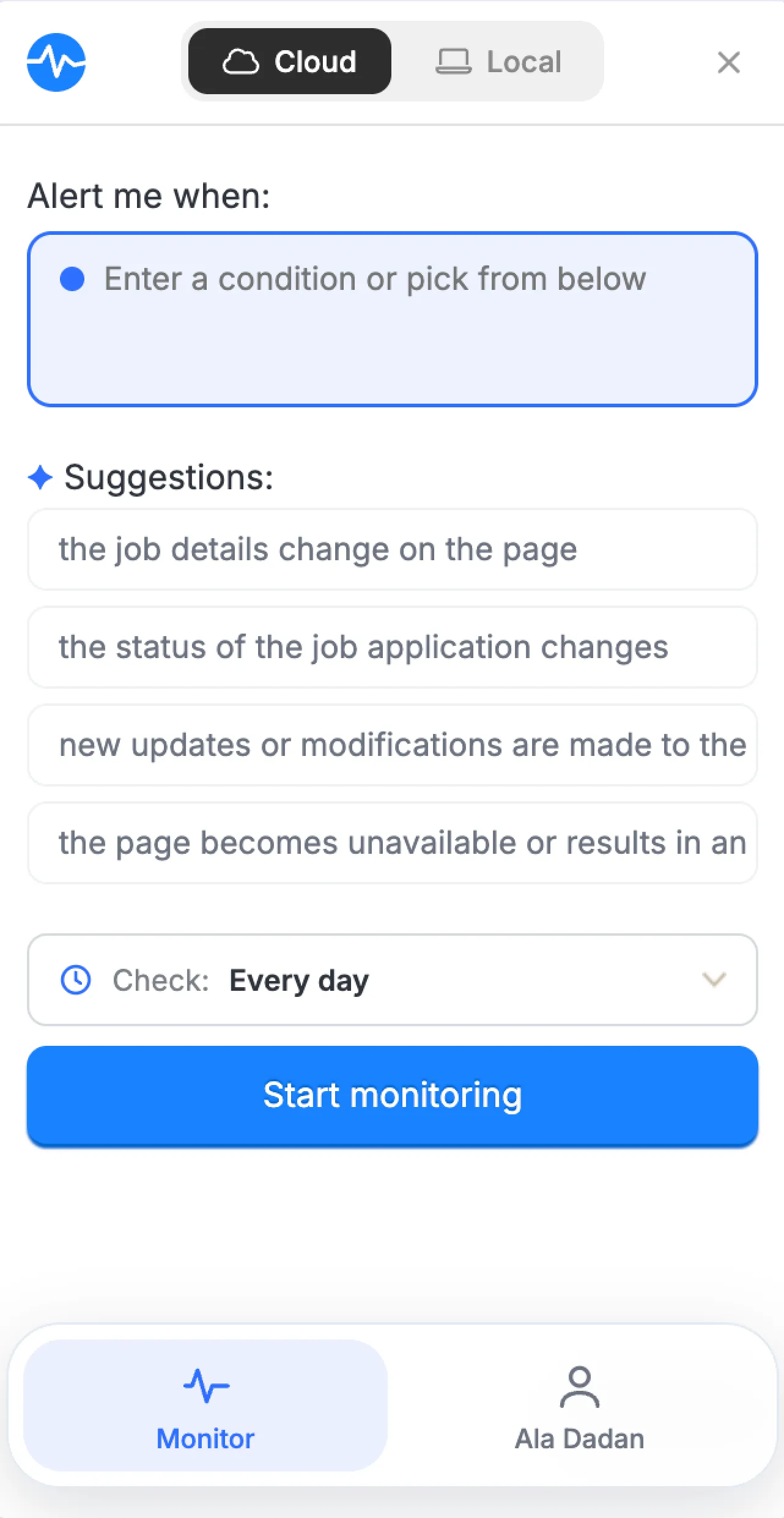
People do not come to Visualping thinking about selectors or compare modes. They think, tell me when this price drops. That became the starting point for the redesign. Visualping now suggests conditions in plain language. People can choose one, write their own, or select an element for more control. Setup becomes a decision instead of a configuration task.
One clear path
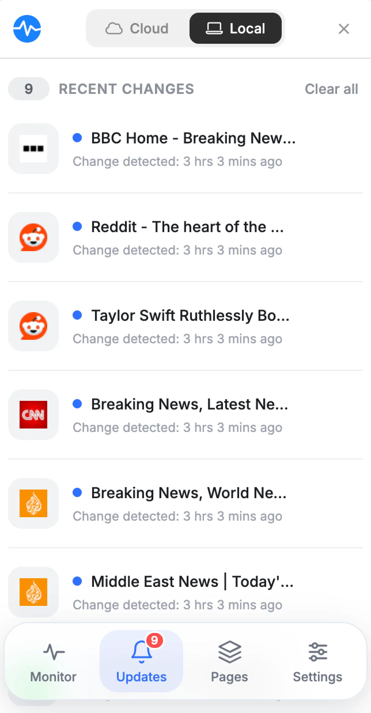
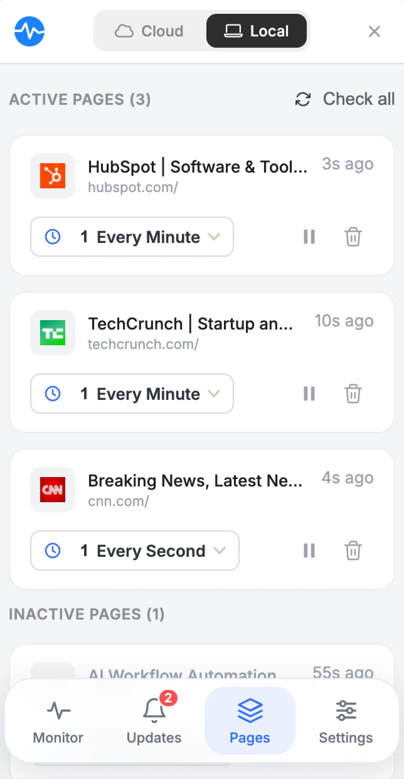
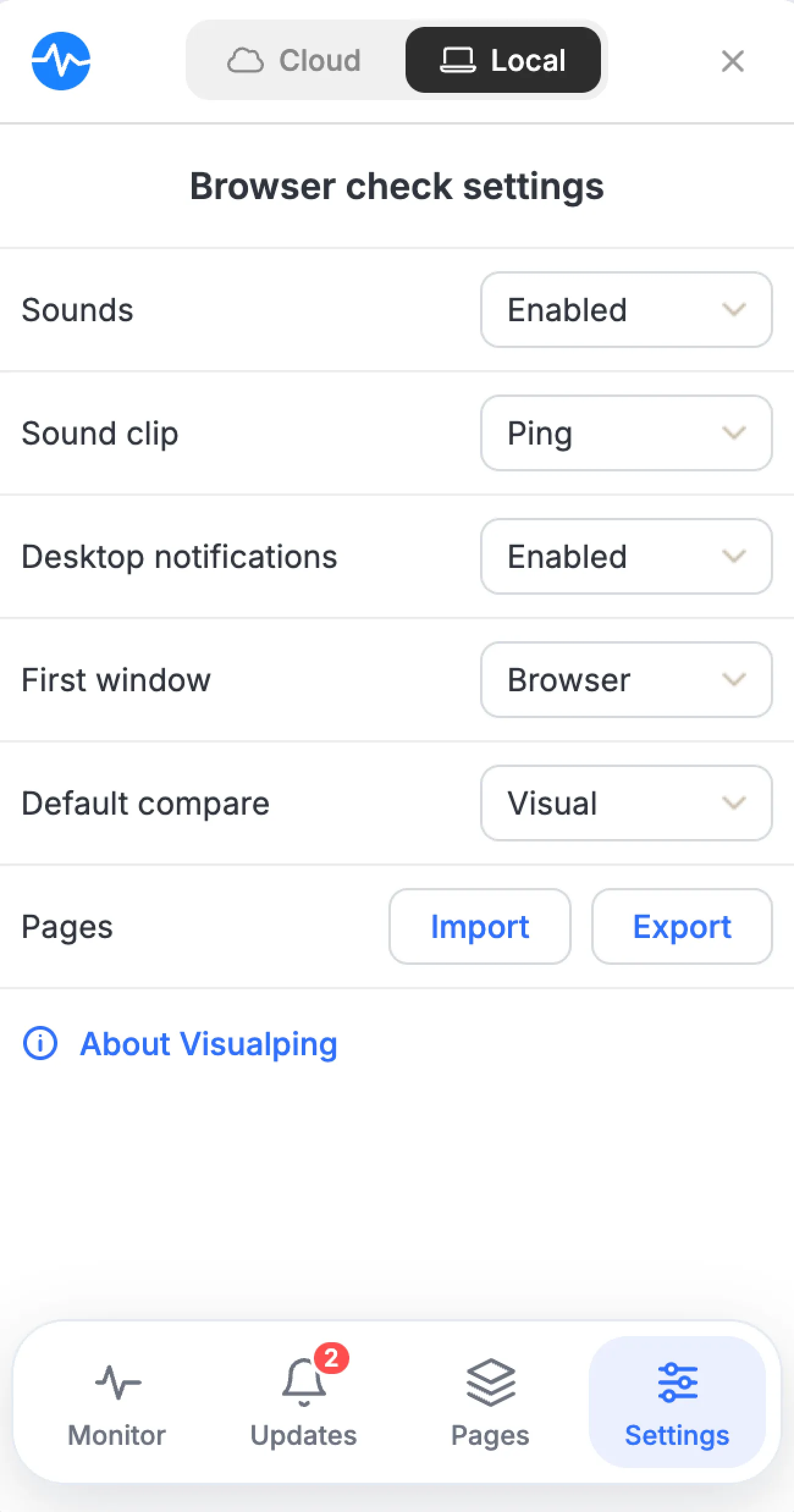
I brought local and cloud monitoring into one setup flow and explained the difference at the moment of choice. A simple bottom navigation replaced the stacked structure, while shared components, language, and states connected the extension to the rest of Visualping. The product still does complex work, but asks less of the person using it.
Working in the product, not around it
I led product direction, information architecture, interaction design, and the visual system. I worked with engineering because browser constraints shaped what was possible. Using AI-assisted coding, I turned ideas into working UI so we could test states and edge cases beyond static screens. The prototypes gave the team something concrete to review and helped move the work into implementation faster.
What shipped
The redesign launched to over 100,000 Chrome users. It had to remain familiar to returning users while giving users a simpler way in. The shipped experience replaced internal language, brought local and cloud monitoring into one system, and shortened the path from opening the extension to starting a monitor. Its listing remains Featured, with a 4.4-star rating from 7.3K ratings.
VIEW ON CHROME WEB STORE →What I took from it
- 01Different technical systems can still feel like one product.
- 02AI works best when it offers a starting point while leaving people in control.
- 03Good product design often comes from deciding what can stay quiet.